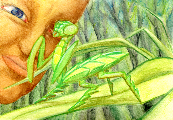
Previously, the seeds of LITTLE MONK & THE MANTIS took root, with a finished manuscript finding a publisher and the author finding his artist.
With a working title of “Mantis looks at the Moon” the manuscript containing thumbnail sketches in its margins was set aside. These sketches would be expanded into a series of layout drawings breaking down the story into the book’s allocated pages. At one point there were considerations for step-by-step kung fu sequences, like what might be seen in a comic book. It was decided, instead, that a story rich in the imagery of Chinese martial arts and ancient legend should be painted combining modern illustration techniques with the traditional Chinese xie yi (Freehand 寫意) watercolor brush.
Emphasizing the “kung fu movie” quality of the story with a wide-screen approach to illustrating its pages, the initial page layout was designed to be an eight inch square which opened to a wide eight inch by sixteen inch spread. The resulting double-page spreads would be more effective for immersing the reader into the world being described. The initial layout consisted of thirteen double-page illustrations resulting in twentysix pages of story.
[photomosaic ids=”363,364,365,367,368,369″ loading_transition=”scale-up” order=”rows”]
Next to follow would be the development of a color scheme. As a setting, Shaolin Temple possesses an iconic color scheme which extends into the mode of dress. While details would certainly be worked out later, the color layouts were developed to create a narrative rhythm and allowed for the adjusting of mood and setting.
[photomosaic ids=”388,389,390,391,392,393″ loading_transition=”scale-up” order=”rows”]
It was at this point when a finished piece of artwork was started, to serve as a sample and style guide. It would be the first scene in the book, spread one; printed on pages 1 and 2 it could be used to establish the mood and color pallet for the story on a whole.


As the first of the book’s illustrations reached completion, it was decided that the finished book should be printed in a larger format. It would be premiere as a hard cover book with dust-jacket. The changed layout was included in a refined version of the color layout which included additional details and changes. Such as the setting of the temple yard as well as a more distinct color scheme for the monkey’s forest.
[photomosaic ids=”403,404,405,407,408,410″ loading_transition=”scale-up” order=”rows”]
With the first spread completed and approved, the creation of the bulk of the storybook’s artwork would happen in a series of marathon painting sessions. The twelve remaining spreads would be painted simultaneously. Each layout was drawn to the size of the finished art and mounted onto a matched sheet of plexiglass. On top of the mounted drawing a sheet of water-color paper would then be taped, this would be the surface upon which the colored artwork would be drawn in water-soluble color pencil then finished in brush.

One thought on “Illustrating Little Monk and the Mantis: pt. 2”
Comments are closed.