I initially intended this post to coincide with October’s #Inktober activities but was some how pulled into other efforts. Months later I might as well publish this as a sort of Throwback-Thursday post rather than wait until October of this year.


Toward the end of September 2014, Marc Arsenault of WoW Cool and Alternative Comics put the word out for some inking assistance. Turns out David Lansky and Marc’s son collaborated on a Halloween themed minicomic; David provided pencils and story based on the idea provided by James. What was needed to see the project to completion was inks and Marc cast a wide net seeking inkers. Fortunately I got my name in the line-up of artists gathering to contribute before all eight pages were assigned.
PSA: In the time since the mini-comic was published the Alternative Comics store has been repeatedly burglarized, costing Marc time and money (repairs + stollen books). So if you like what you see here, order a printed copy, then go ahead an buy a bunch of other stuff; there’s plenty of great stuff on offer.
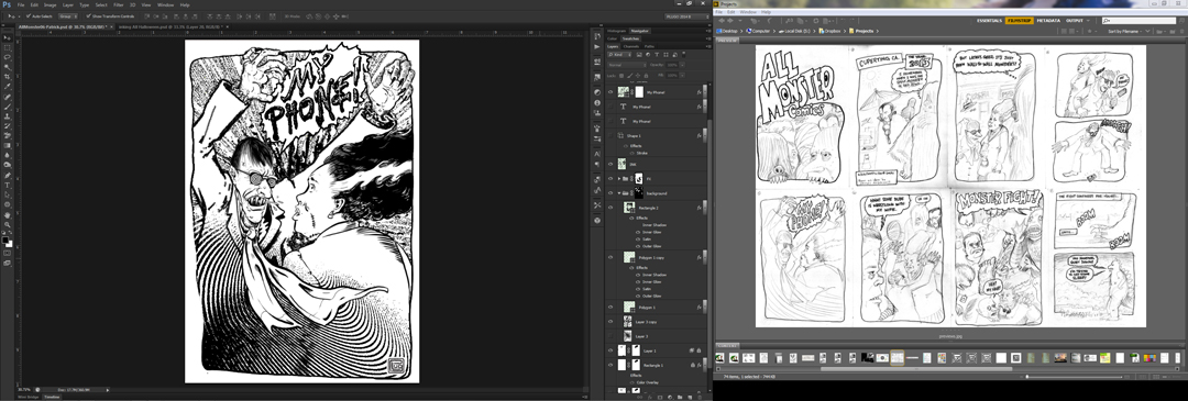
Looking back, I laughed out loud when I saw the page I was given and decided digital inks would provide immediate fun and results. As I set-up my workspace for this quick project, it occurred to me I might as well generate the occasional screen capture to log the actual steps involved in creating this art. Above you can see the slideshow, I’ll go into a bit of detail below.

Each screen capture show’s two actual screens, side-by-side. Depending on the tools I use, those screens (A. left and B. right) may actually be above one another in reality.

Converting the pencil scan to an non-repro blue is a bit anachronistic for digital inking, but years of analog illustrating have got me used to inking over blue pencil lines. You can see the new colored layer in layers window at the bottom. I’ve also switched views from an image preveiw to Adobe Bridge on screen B.

On a third Layer I used some dedicated masking to make use of the original outlines for the panel border and word balloon.

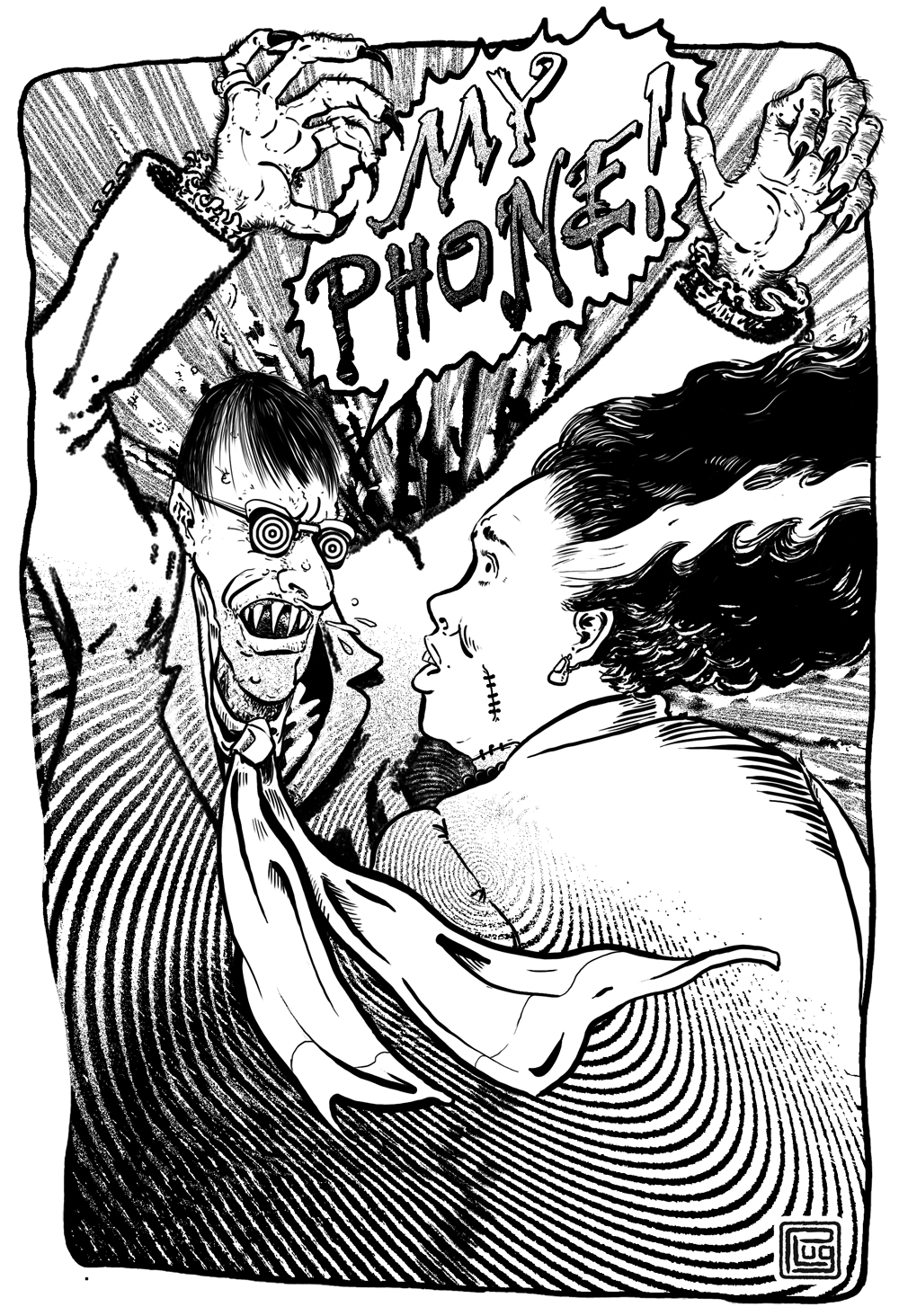
I was initially going to hand letter the panel, but thought I would have a look in my font library for something appropriate. When I came across the “Buffy the Vampire Slayer” inspired typeface I had to use it. A sort of in-joke for anyone inclined to notice.


After the application of some layer styles, the lettering is warped into place and adjusted.


Once the lettering is complete a new inking layer is created and a brush is selected.


After enlarging the view to get the lines of Mrs. Frankenstein in place, the inking of key elements around her flowed rather quickly. Keeping the shape dynamics of the brush set to pen pressure, I could toggle the bracket keys to adjust the brush’s diameter.

A close look at the pencil art and one can see the motion lines Dave Lansky suggested in his pencil art. To me there was a swooshing quality that had me imagining the Phone Ghoul (for lack of a better name) swooping past her… like the smell of stale coffee on a gust of wind. As a set out to create the motions lines another concept came to mind: “What if, rather than him screeching “My Phone” as he sweeps around her he was actually attempting mind control?” Those musings would return when I set out to actually ink that character, but for the moment I wanted to create some acting that could be interpreted in a couple of different ways. I only just discovered another interpretation that I hadn’t even considered and now love! (more on that later).

The recipe for those concentric circles is a simple one. On a new layer fill a marque box 50% gray, then use the “Sketch” filter “Half-Tone Pattern.” Beyond the dots that make up a typical half-tone pattern that filter can also generate horizontal lines and concentric circles toggling between line density and contrast. After adjusting the threshold and eliminating any grays, The free transform edit let me distort the circles into a more elliptical shape.

The finished effect was ultimately composed of three copies of the concentric circles layer, individually masked and grouped with an adjustment layer and masked to match the panel border. With the Special Effect complete A new finer brush was selected to ink some character details on the character I’ll continue to call the Phone Ghoul.

It’s difficult to anticipate what will draw the attention of other inkers in this sort of JAM project. Keeping the pencil artwork from the rest of the story on screen B allowed me to use the Adobe Bridge zoom feature to keep specific character details in mind and within my peripheral vision.

At last; a very agitated Phone Ghoul!

Once the characters have been completed there’s a bit of room to return to emphasizing the drama with background effects.


As I bring this post to a close it occurs to me I could have taken better notes; I shouldn’t have just relied on my memories of a recently completed project to recall the pixel size of brushes. Nevertheless, this project was both extremely fun to be a part of (thanks Marc) and gratifying in retrospect. If I had gotten this done earlier I’m not sure I would have come across the in-depth review of this project provided by PanelPatter.com. Excerpt Below…
But this one has an extra twist, and that’s watching the passel of inkers show how the same creator’s pencils can be re-interpreted. It’s something that gets talked about a lot, but when you get to see the experience in an actual comic, with notes telling you who each inker was, it’s a great time for those of us who enjoy looking at comics from a craft perspective.
I won’t belabor it here, but just a few quick examples:
- When K. Thor Jensen gets the Bride of Frankenstein, her hair is a solid block of black with the traditional white streak. In the very next panel, however, Karl Stevens gives her hair individual strands. When we see Reid Psaltis ink the monster’s hair, she’s got more of a wave, giving her slightly natural curls. The white shock is now more grey, as it is flecked with black lines, not just as a white shock, imitating what real hair might do.
- The use of hatching or solid shading varies from creator to creator, adding or subtracting to the level of depth and detail. Some prefer to keep it basic, focus on the characters, while others show that there’s gradients across the brick buildings.
- Patrick Lugo’s panel is the most dramatic, using a spiral pattern to focus on the fact that the Bride has attacked our protagonist. It’s impossible for me to know how many of those lines were in the original pencils, but the inking is all designed to take advantage of the spiral construction of the pattern, radiating out from the punch to the gut.
It’s great stuff, both on a macro and micro level, and you can’t beat the price of FREE.
Now go read the rest of the review and then check out some of their other entries, that’s what I’m about to do.
Discover more from
Subscribe to get the latest posts sent to your email.